Juseung S&A
Corporate print design connecting a blue circular identity across brochure and mailer.
Complex technical information, organized for print
- Brochure editorial design
- Print applications
- Information design
Inti desain
A concise cover and detailed technical interior create a clear reading path.
Tantangan yang harus diselesaikan
A broad technical service offering called for a clear first impression and a more detailed second layer.
Pendekatan yang kami pilih
A circular motif and blue palette link the cover, mailer and inner pages, while tables and procedures receive their own sections.
Yang berubah
The portfolio shows the reading path from corporate introduction to technical detail.
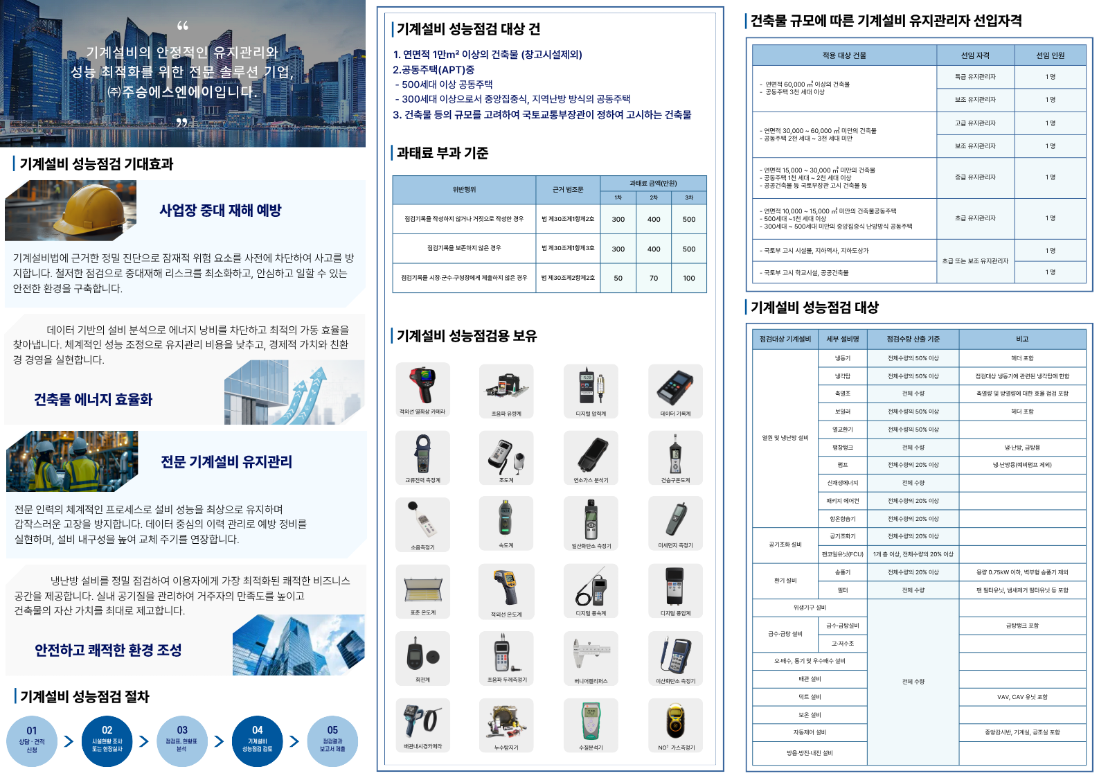
Brochure interior for deeper information
Original artwork organizes service descriptions, tables and equipment into sections.
Clarity on the first page
The company name and key image lead; detailed technical content moves to the unfolded pages.
Order in the detail
Tables, equipment and procedures are grouped into distinct sections for easier scanning.
Grounded in the originals
Original print photography and artwork are kept as evidence; the mockup is identified as a visualization.