Nonhyeon Bada
A seafood-inspired line mark connects the restaurant's spatial impression and printed touchpoints.
A maritime identity, from mark to space
- Logo & brand identity
- Print applications
- In-store applications
L’essentiel du design
A line-drawn mark becomes a consistent language for the restaurant and its printed touchpoints.
L’enjeu à résoudre
The restaurant needed a concise visual language that would communicate its maritime character to first-time guests.
L’approche choisie
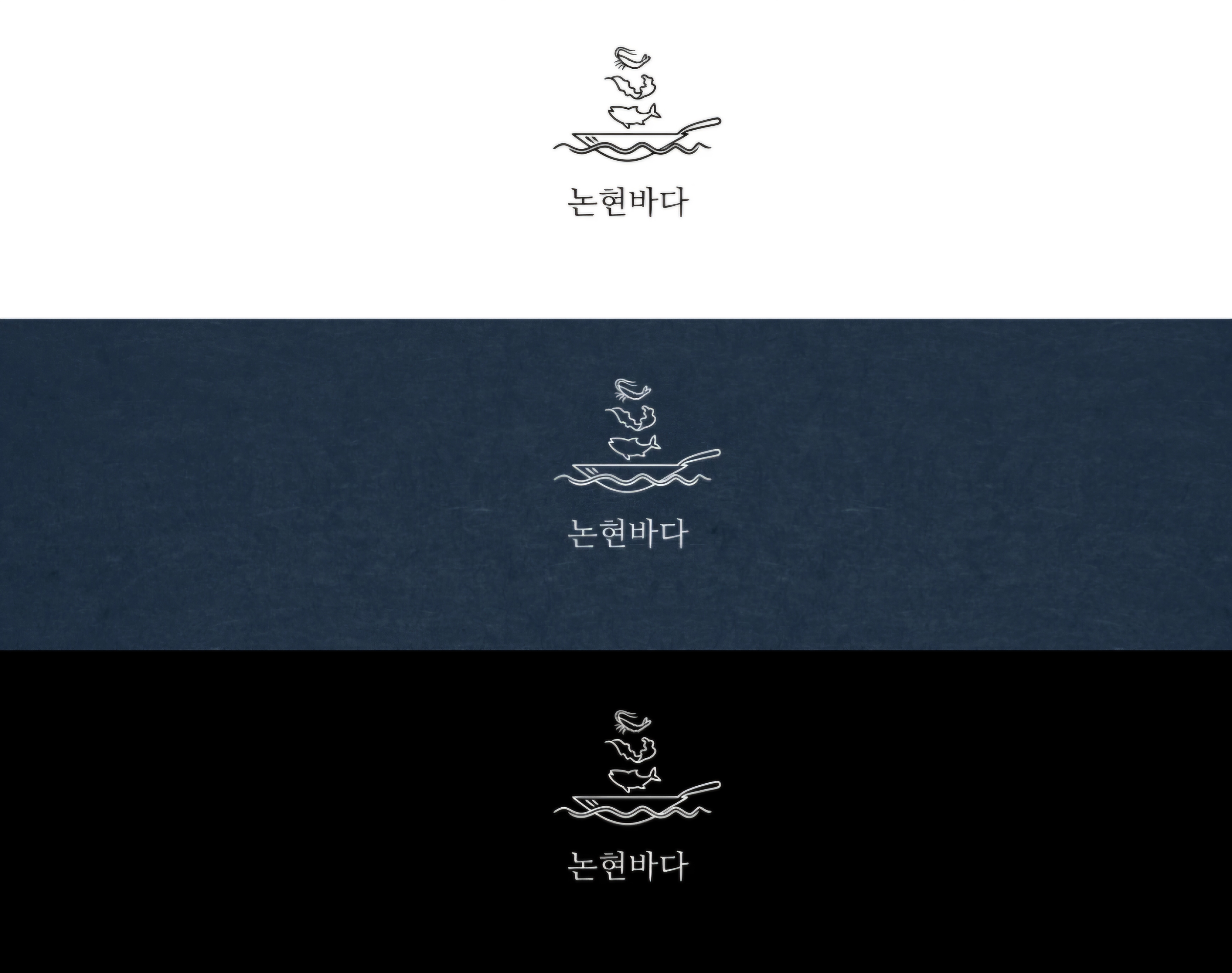
We centered a line-drawn mark combining seafood, a plate and waves, and considered its legibility on light and deep-navy surfaces.
Ce qui a changé
The case brings together the original identity study and its visible in-store application.
Logo study: elements of the sea in one mark
The original study tests the symbol and name on white, navy and black grounds.
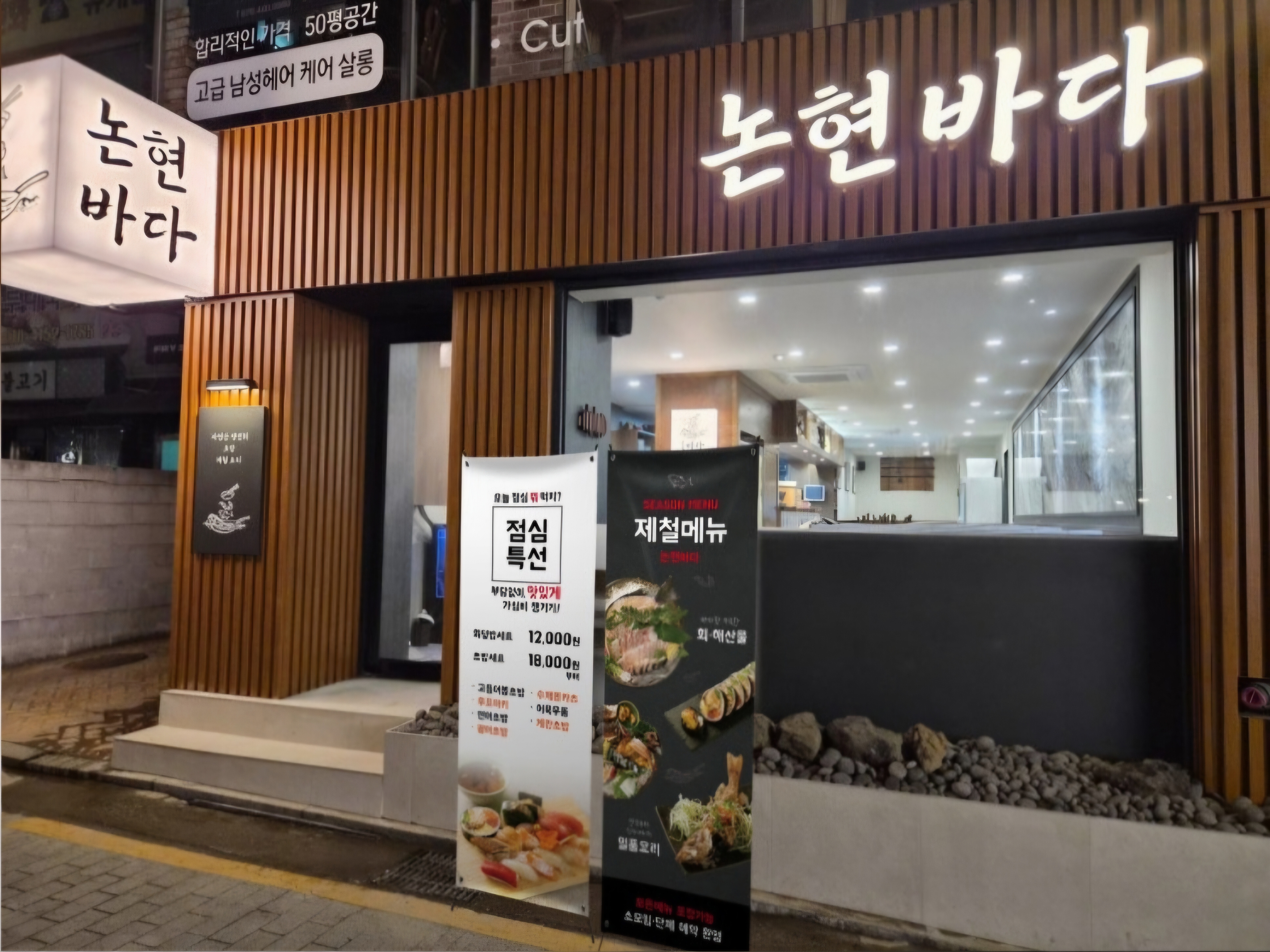
The identity in the actual storefront
A real-site photo shows how guests encounter the sign and exterior.
A recognizable symbol
Linear elements evoke food and sea in a single, recognizable mark.
Consistency across media
The case pairs original logo studies with a real storefront photo to show how the identity reads in print and space.
Actual work and visualization
The print mockup is a portfolio visualization based on the original logo and is labeled separately from the storefront photo.