Tardang
Dessert identity extending expressive letterforms and an egg-tart image across bags, signs and packaging.
The egg tart becomes the final letter of the brand
- Logo & brand identity
- Packaging & paper bags
- Signage applications
Lo esencial del diseño
The wordmark and signature product meet in one mark, carried through packaging and signage.
El reto por resolver
The egg tart had to connect naturally to the name while leaving the same impression on a distant sign and a take-away bag.
El enfoque que elegimos
Expressive heavy letterforms meet a golden egg tart, supported by kraft-paper texture and a small red seal.
Lo que cambió
The product's shape becomes an identity that carries across packaging and physical touchpoints.
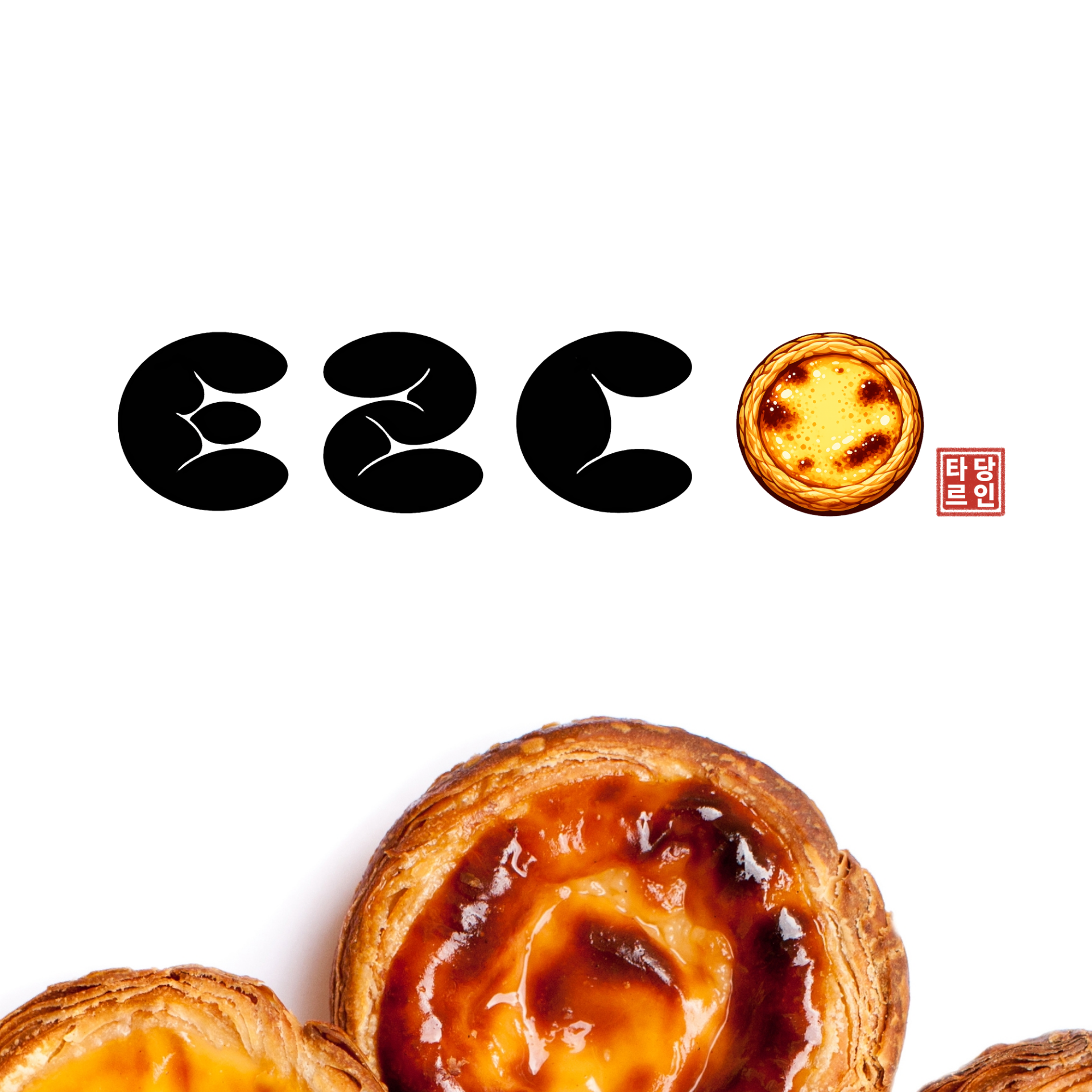
Original logo: letters meet the tart
The original artwork shows how letterforms, egg-tart imagery and the small seal relate.
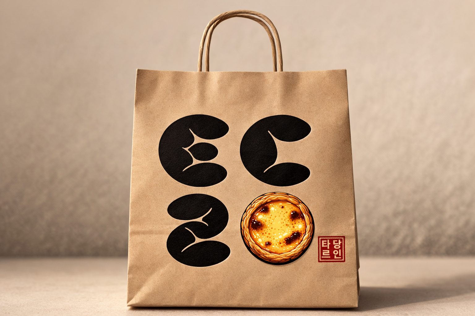
A brand carried by hand
The original packaging image applies the identity vertically on a kraft paper bag.
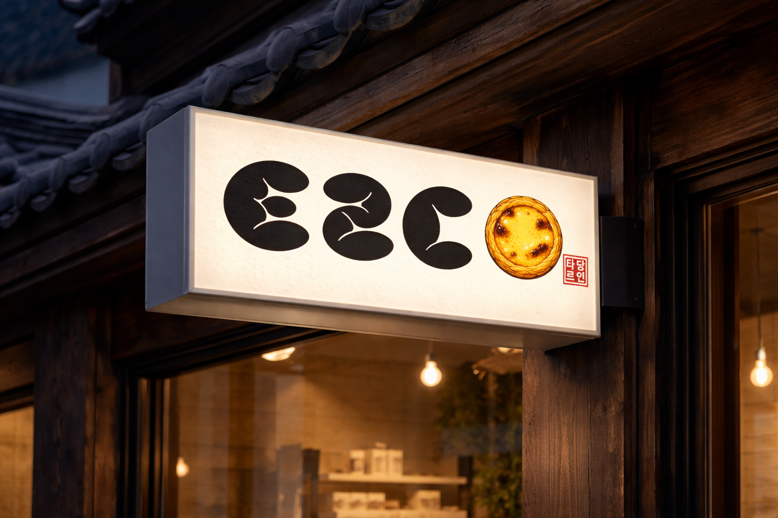
A horizontal sign read from the street
The original sign image shows the product motif and red seal at storefront scale.
A letter completed by the product
The final round element becomes an egg tart, bringing name and signature product into one view.
Consistent from street to hand
The original applications show the same visual rule working on a horizontal sign and a vertical bag.
Rebuilt from the originals
Original logo, bag and signage images are preserved and shown separately from the staged cover.